Hi, I'm Jason Eng.
A UX designer based in the Houston area, with a background in video ethnography and tech support. I help teams identify problems and build solutions.
Here are two project case studies.
SafeMode Fleet Management App
UX Design Case Study

The Challenge
How can artificial intelligence be used to protect drivers?
What would this functionality look like?
How can drivers and fleet managers improve engagement?
SafeMode's existing dashboard mockup
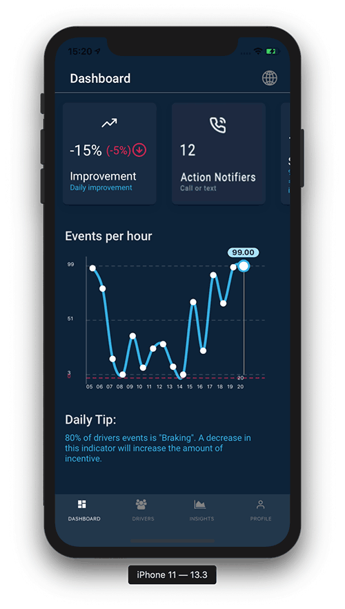
SafeMode Expectations for their new fleet manager App
1. Improved driver-manager relationship
2. Safer driving behavior
3. Managers less stressed
4. Drivers are consistently well incentivized
2. Safer driving behavior
3. Managers less stressed
4. Drivers are consistently well incentivized
Background
My role was to research the competition, audit their prototype design and then provide some new features ideas represented by mockups.
SafeMode's successful driver app has provided several assumptions which I validated in Interviews with Fleet Managers:
Drivers don’t care [about safety]
Drivers and managers don't get along
Drivers don't want to be monitored
Drivers only care about money
Fleet managers are overworked
Fleet managers spend too much time trying to retain drivers
Drivers and managers don't get along
Drivers don't want to be monitored
Drivers only care about money
Fleet managers are overworked
Fleet managers spend too much time trying to retain drivers
Research Phase
I started to better understand SafeMode's World during research and synthesis, starting with this combined affinity diagram/matrix.
I placed quotes from my interviews with SafeMode and a fleet manager on virtual sticky notes, then grouped and colored them toward the four corners.
Using this matrix gave me a sense of how to approach the broad challenges SafeMode is taking on.
Click paths
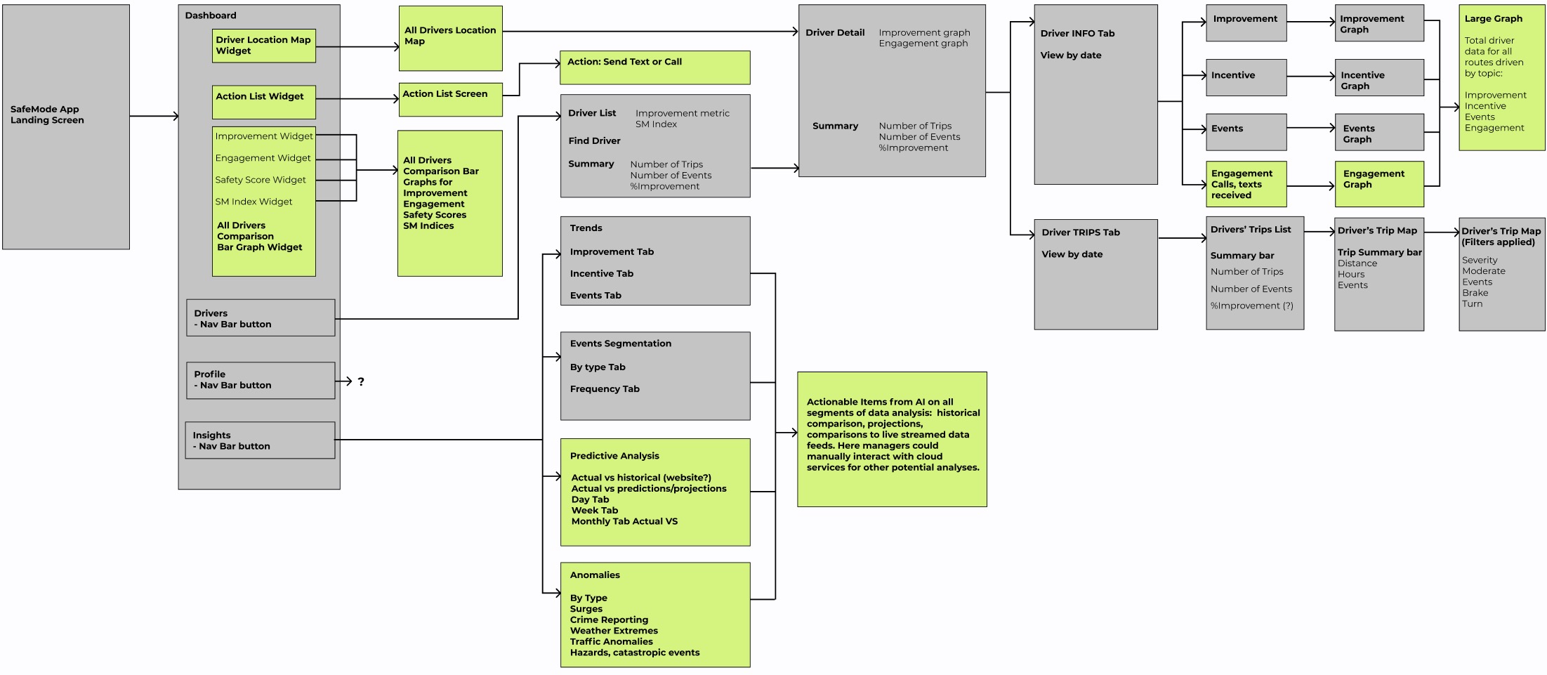
Then, using a confidential video that SafeMode provided (which cannot be shared here) showing a prototype in use, I mapped the click paths and found areas for improvement or expansion, highlighted by the green boxes.
My Recommendations for their new app:
1. A map of all active drivers by location.
2. Graphs comparing live driver profile data.
3. Safety/environmental projections based on AI.
4. Action notifiers for strategic engagement.
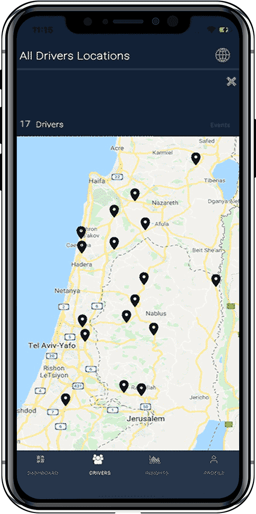
1. A map of all active drivers is a feature fleet managers rely on daily.
They should be given the option to use familiar tools.
They should be given the option to use familiar tools.
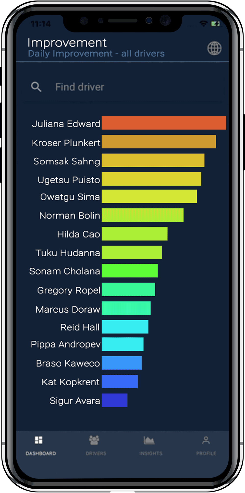
2. This graph comparing driver statistics can help managers implement gamification to their fleet by comparing general profiles and specific performance data.
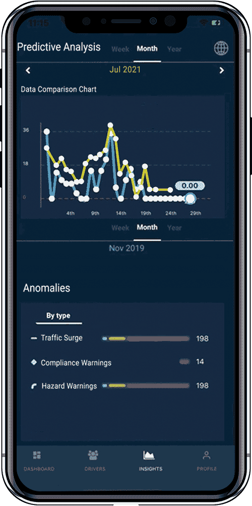
3. This feature compares actual and historical data over specific time periods. It will reflect the insights generated for driver planning and safety.


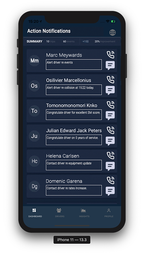
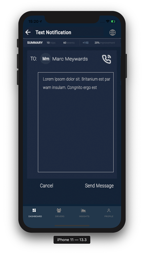
4. “Action Notifiers.” Managers can engage strategically with drivers. This is a feature that will not only automate routine messaging, it will more importantly enable fleet managers to transform the character of driver-manager relationships from negative to positive.
What I learned
Using the tools from my UX Design coursework, I was able to overcome feelings of being stuck, and at times overwhelmed. Taking the initiative to construct what I felt was the best work I could do, whether or not it fell perfectly within the envisioned goals, pulled me out of moments of uncertainty.
One of the great things about UX Design is the collaboration. Taking cues from seemingly insignificant comments can lead to important insights.
One of the great things about UX Design is the collaboration. Taking cues from seemingly insignificant comments can lead to important insights.
Click to test a hi-fi prototype
The goal: create a vocabulary-building game that you won't get tired of
Background
Today’s most popular language learning app, DuoLingo, has 70 million users. The CEO had this to say about his customers:
They aren’t actually that interested in learning... they just need something other than Candy Crush to spend some downtime.
For those who need to learn Mandarin effectively, two things are vitally important:
It needs to keep your attention...
...and has to fit your individual needs
...and has to fit your individual needs
As a capstone project, I decided to design
a habit forming game which presents slabs
with images, like the one below.
a habit forming game which presents slabs
with images, like the one below.

Researching Learners
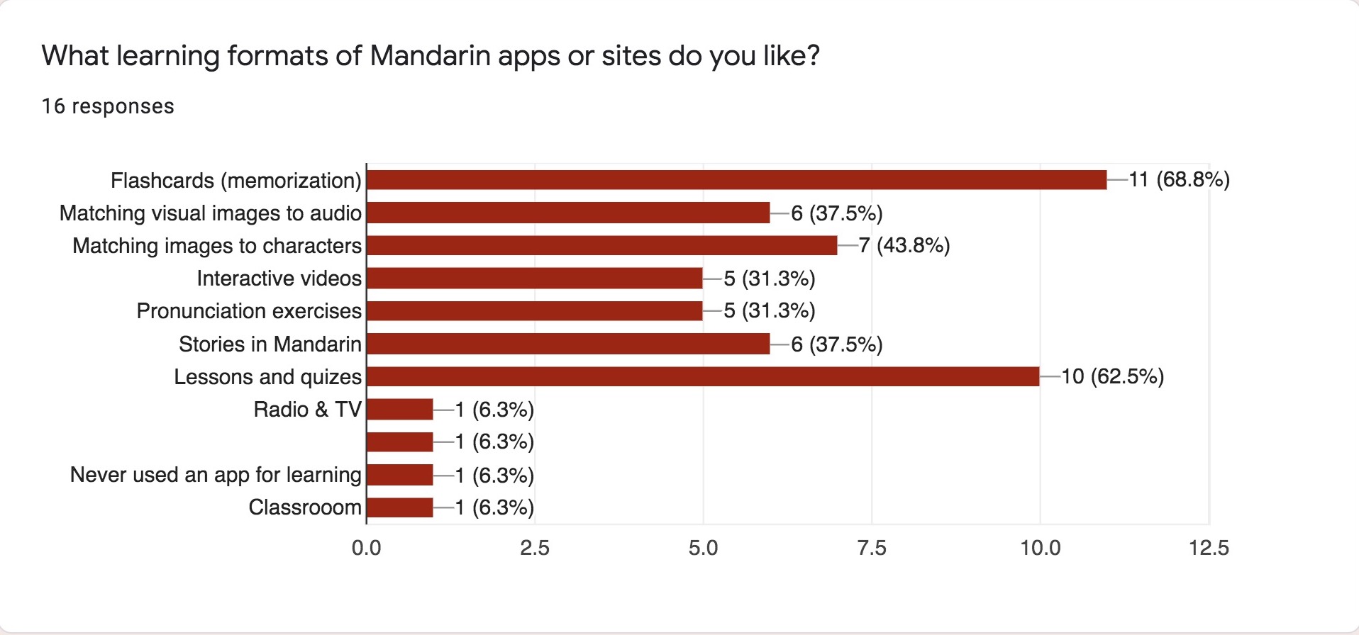
To my surprise, my surveys revealed that learners favor visual aids in general, and in the example below, flashcards are preferred over lessons and quizes.
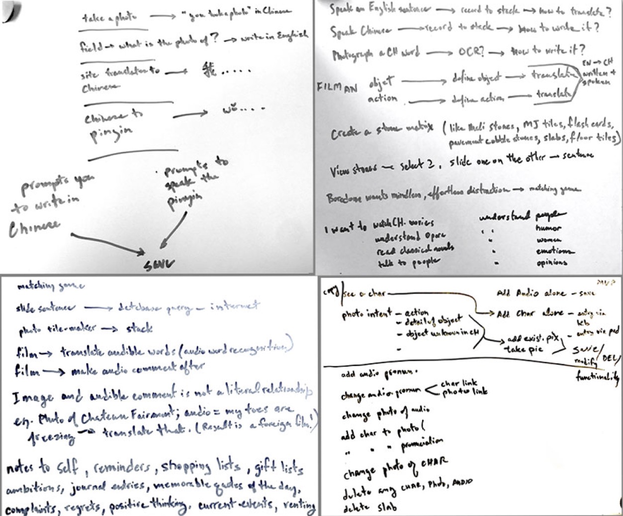
These notes represent the Ideas I had about how an photo language learning app could work: since people already take lots of photos why not extend that behavior to their language learning?
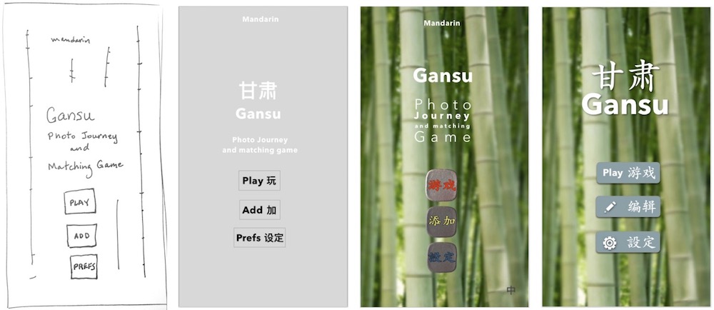
Home screen evolution from Sharpie to Sketch hi-fi mock-up.
How Gansu works: Take a photo, record the word(s), play the game later.
Take a photo of an object and record its pronunciation in Chinese with your own voice. That memory becomes a "slab" which appears on the playing surface. Each slab has a photo of an object on the flipside. Tapping a slab triggers the audible Chinese pronunciation of the object in the photo.
Pinching allows zooming in and out of the playing surface so that you can move around and find the slab you are looking for on a small screen.
Pinching allows zooming in and out of the playing surface so that you can move around and find the slab you are looking for on a small screen.
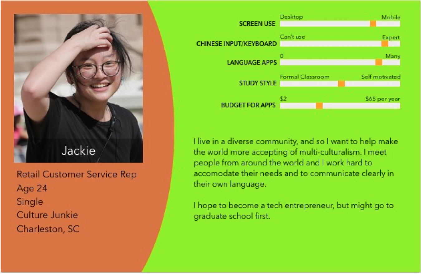
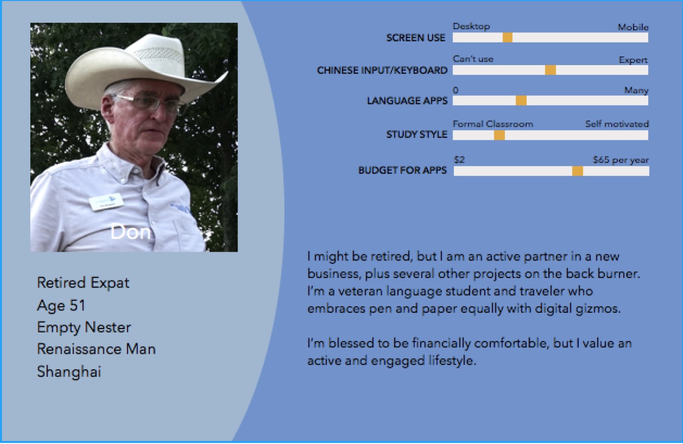
Locals and expats alike showed enthusiasm for more visual emphasis in language tools according to my surveys.
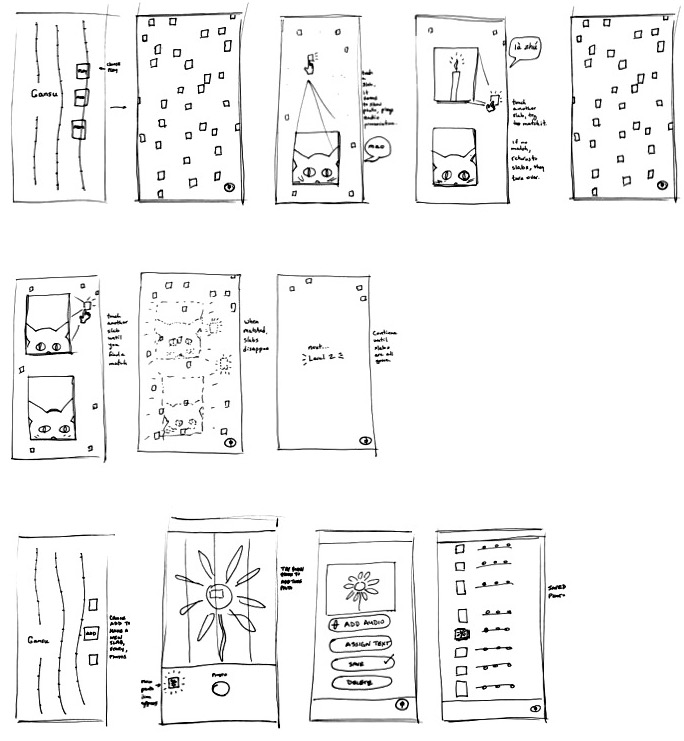
Guerrilla Usability Testing: Drawings of the matching game and screens of the photo/audio recording functions. These were used for guerrilla usability tests at a coffee shop with five random respondents.
A style guide sets the visual parameters of the design. These are my choices for the presentation of buttons, text and colors.
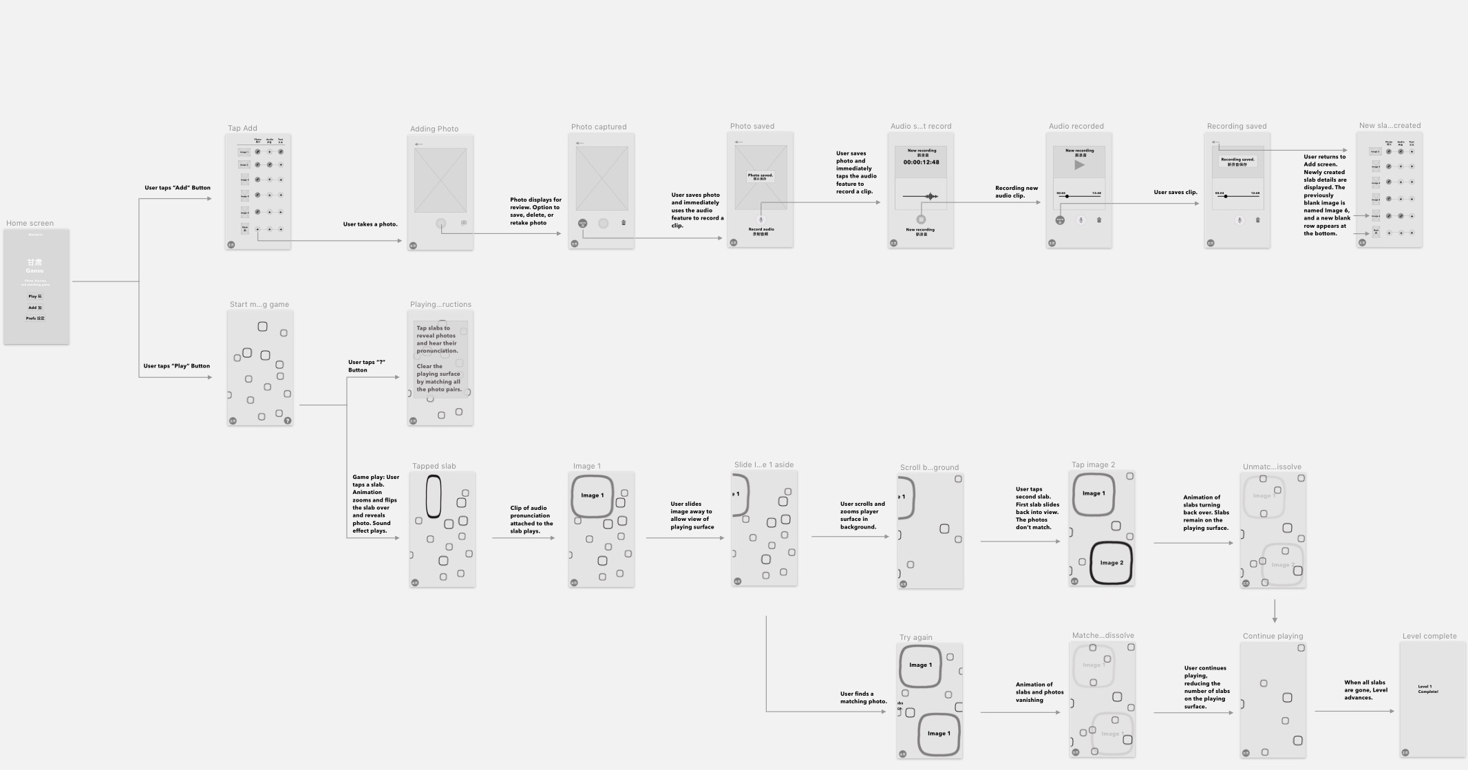
These are low fidelity renderings of a user flow. It shows the progression of screens that you see during game play and during the tasks of adding photos and audio recordings which form the content of the game.
And finally here are high fidelity mock-ups (done with Sketch) which were used in remote moderated usability tests.
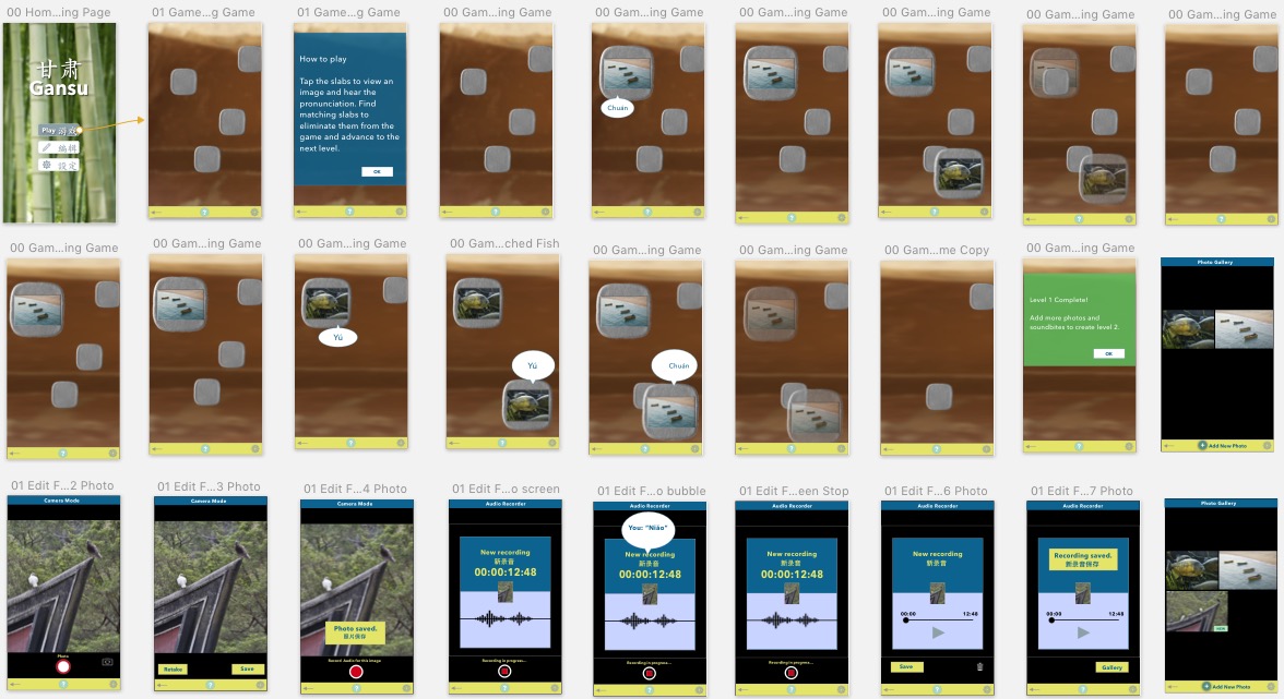
Gansu is a matching game that speaks the vocabulary instead of showing written text. This how the playing surface might look like. You tap on a slab to reveal its photo and you hear the Chinese pronunciation of the object in the photo. Match all the slabs to clear the playing surface.

Learnings
Usability testing for a game has to be tightly controlled and customized to the limitations of the prototyping tool used.
If you are inspired by your novel project and the research has convinced you that it will work, presenting the project persuasively to stakeholders will be a lot clearer and easier.
Going forward I would like to add the ability to import images from other sources, as well as import pronunciations.
Visual object recognition and character recognition would also exponentially broaden input choices.


